The Science of Colour Psychology in Marketing: Data-Driven Strategies for 2025

Bottom Line Up Front: 85% of shoppers say colour is the main reason they choose to buy a product, and colours can increase brand recognition by up to 80%. The data is clear—colour isn’t just aesthetic, it’s a conversion catalyst that smart marketers can’t afford to ignore.
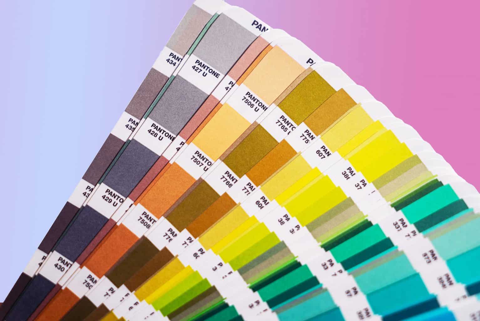
Colour represents one of marketing’s most underutilised yet scientifically proven tools for influencing consumer behaviour. While brands like Coca-Cola, McDonald’s, and Facebook have built instantly recognisable colour identities, the true power of colour psychology extends far beyond brand recognition into the realm of measurable consumer action and purchasing decisions.
The science behind colour psychology has evolved dramatically, supported by neurological research and extensive A/B testing data that demonstrates its tangible impact on conversion rates, trust building, and consumer engagement.
The Neurological Foundation: How Colour Actually Works
Colour psychology isn’t marketing mysticism—it’s rooted in measurable neurological responses. A recent 2025 study using electroencephalography (EEG) and eye-tracking sensors measured participants’ neurological and ocular responses to different colour schemes in digital advertisements, revealing that warm colours and high-contrast advertisements significantly outperform others in driving click-through and conversion rates.
The study’s findings align with what colour psychology pioneer Carl Jung established in the early 1900s: colours trigger specific emotional and physical responses. Red can literally increase heart rate and blood pressure, while blue activates areas of the brain associated with calm and trust. These aren’t abstract concepts—they’re measurable physiological changes that directly influence purchasing behaviour.
Colours alone can influence up to 90% of an initial impression, making them arguably more important than product descriptions, pricing, or even brand reputation in those crucial first moments of consumer engagement.
The Data Behind Colour Impact: What the Numbers Really Say
Recent research has provided unprecedented insight into colour’s conversion impact:
Conversion Rate Effects: Red call-to-action buttons are almost 34% more likely to grow discussion and sales, while one digital marketing agency observed a 32% increase in conversions by changing their primary colour from green to orange.
Attention and Engagement: Colour ads get 42% more attention than black-and-white ones, demonstrating colour’s fundamental role in capturing consumer attention in increasingly crowded digital environments.
Trust and Security Perception: 46% of consumers say blue instils the most trust/security for pet food websites, illustrating how industry-specific colour applications can dramatically influence consumer confidence.
Business Perception: 83% of managers believe that using the right colours in their branding helps their business appear more successful, while 81% of small business owners think that their choice of colours helps them stand out and stay competitive.
The Psychology of Specific Colours: Beyond Basic Associations
Red: The Urgency Catalyst
Red’s power extends beyond simple “excitement.” Red increases people’s heart rate and blood pressure, making it associated with movement and excitement. This physiological response explains why fast food chains like McDonald’s and KFC leverage red to simultaneously stimulate appetite and encourage quick decision-making.
Strategic Application: Red is often used in clearance sales to urge action and appears in 59% of major retailers’ branding. The colour creates genuine urgency—not just the perception of it.
Blue: The Trust Builder
Blue is liked by 57% of men and 35% of women, making it the most universally appealing colour. According to Fortune 500 logos, blue is related to almost 40% of logos in the list, reflecting its effectiveness in establishing corporate credibility.
Beyond trust, blue has practical applications for digital platforms. Its potential hunger suppressant qualities could encourage social media users to delay meals and stay engaged longer—explaining why platforms like Facebook, Twitter, and LinkedIn all employ blue in their interfaces.
Green: The Harmony Generator
Green’s association with nature, health, and tranquillity makes it particularly effective for brands emphasising sustainability, wellness, or financial growth. Companies like Starbucks, BP, and even financial institutions leverage green to convey environmental consciousness, health benefits, or financial prosperity.
Purple: The Luxury Signal
Purple’s association with wealth, luxury, and wisdom makes it a powerful tool for premium positioning. Brands like Cadbury, Wimbledon, and various luxury cosmetic companies use purple to convey sophistication and justify higher price points.
Emerging Insight: Orange is the least-liked colour, with 33% of women and 22% of men disliking it, yet it can be highly effective for conversion-focused elements precisely because it stands out against more popular colour schemes.
Cultural and Demographic Nuances: The Personalisation Factor
While broad colour associations provide useful frameworks, people perceive colours differently depending on their gender and culture. In the median, females are more liable to understand the differences in colours than males, whereas males are more likely to be related to colour blindness.
This creates both challenges and opportunities for global brands. The same colour that builds trust in one market might create confusion or negative associations in another. Successful colour strategies require market-specific research rather than universal assumptions.
Practical Implication: What matters most isn’t the inherent “meaning” of a colour, but the perceived appropriateness of the colour being used for the particular brand. A bright orange might be inappropriate for a funeral home but perfect for a fitness brand.
How Affiliate Marketers Can Leverage Colour Psychology for Higher Conversions
For affiliate marketers, colour psychology offers specific opportunities to influence buying behaviour and optimise conversion funnels. As we’ve explored in our conversion rate optimisation guide, understanding what drives consumer action is fundamental to affiliate success.
Landing Page Optimisation
When creating affiliate landing pages, colour choices can dramatically impact conversion rates. Based on the data, here are evidence-based strategies:
Call-to-Action Button Colours: Red call-to-action buttons are almost 34% more likely to grow discussion and sales. However, context matters—red works particularly well when it contrasts with the surrounding colour scheme.
Trust Building Elements: Use blue for trust indicators like security badges, testimonials, or money-back guarantees. This leverages the 46% of consumers who associate blue with trust and security.
Urgency and Scarcity Elements: Implement red or orange for countdown timers, limited-time offers, or stock warnings. These colours trigger the psychological urgency that drives immediate action.
Email Marketing Enhancement
Colour psychology applies beyond websites to email campaigns. Use warm colours (reds, oranges) for promotional subject lines and CTAs, whilst employing cooler colours (blues, greens) for informational content and trust-building elements.
Social Media Content Strategy
Colour ads get 42% more attention than black-and-white ones, making colour choice crucial for social media content where attention spans are measured in seconds. Consider:
- Product Showcase Posts: Use colours that complement the product whilst ensuring high contrast for visibility
- Story Highlights: Create colour-coded categories that align with their psychological associations (green for eco-friendly products, blue for tech recommendations)
- Video Thumbnails: Employ high-contrast colour combinations to maximise click-through rates
Industry-Specific Applications
Different affiliate niches can leverage specific colour psychology insights:
Health and Wellness: Green conveys natural health benefits, whilst blue suggests medical credibility and trust Technology: Blue establishes reliability and innovation, whilst sleek blacks and whites suggest sophistication Fashion and Beauty: Purple and black signal luxury and elegance, whilst vibrant colours can suggest creativity and self-expression Financial Services: Blue builds trust, whilst green suggests growth and prosperity
A/B Testing Your Colour Choices
As demonstrated in our casino bonuses article, understanding psychological triggers is crucial for conversion optimisation. Apply this same principle to colour testing:
Systematic Testing Approach:
- Baseline Establishment: Document current conversion rates with existing colour schemes
- Single Variable Testing: Test one colour element at a time (CTA buttons, headers, accent colours)
- Contrast Testing: Experiment with high-contrast combinations that align with psychological associations
- Timing Consideration: Test colour changes during different promotional periods to understand context impact
Measurement Metrics:
- Click-through rates on affiliate links
- Time spent on page
- Email open rates and click rates
- Social media engagement rates
- Conversion rates from traffic to merchant sites
Building Trust Through Colour Consistency
Brands that effectively align their colour strategies across multiple platforms can experience a notable 35% boost in consumer trust. For affiliate marketers, this means maintaining consistent colour schemes across all touchpoints—from social media profiles to landing pages to email signatures.
This consistency builds what we call “colour trust”—when audiences begin to associate your specific colour palette with reliable recommendations and valuable content.
Psychological Pricing and Colour
Colour can influence price perception significantly. Luxury brands often utilise muted tones like black, enhancing the perception of premium quality. In contrast, vibrant colours frequently denote affordability and accessibility.
For affiliate marketers promoting different price points:
- Premium Products: Use sophisticated colour palettes (blacks, deep blues, purples) to reinforce value perception
- Budget-Friendly Options: Employ brighter, more accessible colours (oranges, bright blues, greens) to suggest affordability without cheapening the offering
- Mid-Range Products: Balance sophistication with accessibility through carefully chosen accent colours
Implementation Strategy: Moving Beyond Theory
Understanding colour psychology is valuable only when implemented systematically. Based on current research and our experience in customer experience optimisation, here’s how to apply these insights:
Audit Your Current Colour Usage
Examine your existing marketing materials, websites, and social media presence for colour consistency and psychological alignment. Ask yourself:
- Do your colours match your brand positioning?
- Are you using colours that your target demographic responds to positively?
- Is there sufficient contrast to drive action?
Develop a Strategic Colour Palette
Create a primary palette of 3-5 colours that align with both your brand values and your audience’s psychological preferences. Include:
- Primary Brand Colour: Your main identity colour
- Trust Colour: Usually blue, for credibility elements
- Action Colour: High-contrast colour for CTAs and urgency elements
- Supporting Colours: 1-2 additional colours for variety and specific applications
Test and Iterate
The importance of experimenting with various colour combinations to optimise conversion rates cannot be overstated. Implement systematic testing programmes that measure the impact of colour changes on your specific key performance indicators.
The Future of Colour Psychology in Marketing
As marketing becomes increasingly data-driven, colour psychology is evolving from intuitive art to measurable science. Neuromarketing instruments, including electroencephalography (EEG) and eye-tracking sensors, measure participants’ neurological and ocular responses to provide unprecedented insight into colour’s impact on consumer behaviour.
For affiliate marketers, this evolution means colour choices can be optimised with the same precision as keyword targeting or audience segmentation. The brands and marketers who understand this will have a significant competitive advantage in an increasingly crowded digital marketplace.
Conclusion: Colour as Competitive Advantage
85 percent of purchasing decisions are influenced by colour—a statistic that transforms colour from a design consideration into a strategic imperative. For affiliate marketers operating in competitive landscapes, mastering colour psychology offers a sustainable competitive advantage that can’t be easily replicated.
The most successful affiliate marketing strategies, as we’ve discussed throughout our marketing insights, combine data-driven decision making with psychological understanding. Colour psychology represents the perfect intersection of these approaches—providing measurable results whilst tapping into fundamental human psychology.
In 2025 and beyond, the affiliate marketers who systematically leverage colour psychology—testing, measuring, and optimising their colour choices—will outperform those who treat colour as an afterthought. The data is clear, the tools are available, and the opportunity is significant.
The question isn’t whether colour psychology works—it’s whether you’re prepared to harness its power for measurable business results.


